
The Volatility Cone: A Quant's Tool for Mapping Price Uncertainty
How Jennifer Aniston’s LolaVie brand grew sales 40% with CTV ads
For its first CTV campaign, Jennifer Aniston’s DTC haircare brand LolaVie had a few non-negotiables. The campaign had to be simple. It had to demonstrate measurable impact. And it had to be full-funnel.
LolaVie used Roku Ads Manager to test and optimize creatives — reaching millions of potential customers at all stages of their purchase journeys. Roku Ads Manager helped the brand convey LolaVie’s playful voice while helping drive omnichannel sales across both ecommerce and retail touchpoints.
The campaign included an Action Ad overlay that let viewers shop directly from their TVs by clicking OK on their Roku remote. This guided them to the website to buy LolaVie products.
Discover how Roku Ads Manager helped LolaVie drive big sales and customer growth with self-serve TV ads.
The DTC beauty category is crowded. To break through, Jennifer Aniston’s brand LolaVie, worked with Roku Ads Manager to easily set up, test, and optimize CTV ad creatives. The campaign helped drive a big lift in sales and customer growth, helping LolaVie break through in the crowded beauty category.
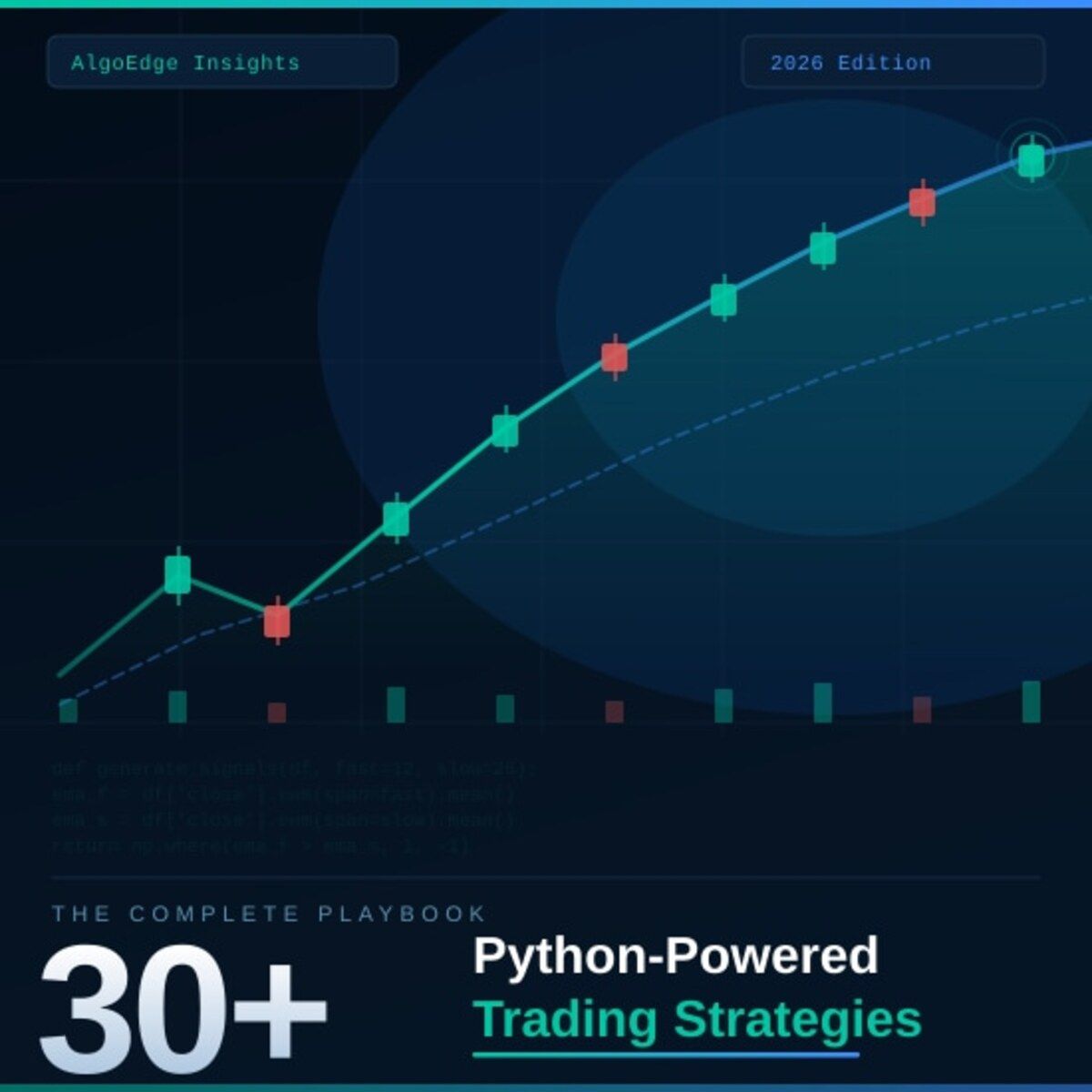
② One strategy in this book returned 2.3× the S&P 500 on a risk-adjusted basis over 5 years.
Fully coded in Python. Yours to run today.
The 2026 Playbook — 30+ backtested strategies,
full code included, ready to deploy.
20% off until Friday. Use SPRING2026 at checkout.
$79 → $63.20 · Expires March 21.
→ Grab it before Friday
⑤ Most quant courses teach you to watch. This one makes you build.
Live. Weekly. With feedback on your actual code.
The AlgoEdge Quant Finance Bootcamp — 12 weeks of stochastic models, Black-Scholes, Heston, volatility surfaces, and exotic options. Built from scratch in Python.
Not pre-recorded. Not self-paced. Live sessions, weekly homework, direct feedback, and a full code library that's yours to keep.
Cohort size is limited intentionally — so every question gets answered.
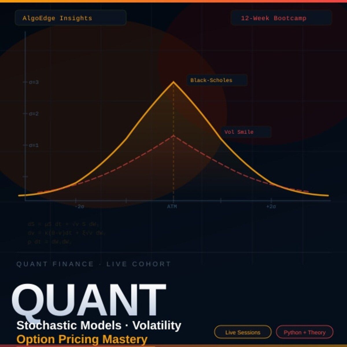
→ Before you enroll, reach out for a 15-minute fit check. No pitch, no pressure.
📩 Email first: [email protected]
Premium Members – Your Full Notebook Is Ready
The complete Google Colab notebook from today’s article (with live data, full Hidden Markov Model, interactive charts, statistics, and one-click CSV export) is waiting for you.
Preview of what you’ll get:

Inside:
📥 Auto-downloads ASML data from Yahoo Finance — change the ticker to any stock you want
📊 Volatility analysis — daily return distribution + rolling 30-day annualized volatility chart
⚙️ Monte Carlo engine — 10,000 simulated price paths using Geometric Brownian Motion
🔀 Two models side by side — Historical Volatility vs BSM Implied Volatility
📈 Confidence cone chart — 68% and 95% intervals with median and mean paths
🎯 Probability calculator — P(above threshold), P(below threshold), P(in range)
📉 Final price distribution — histogram of all 10,000 simulated outcomes with colour-coded zones
💾 Saves 3 charts as PNG files ready to download
Free readers – you already got the full breakdown and visuals in the article. Paid members – you get the actual tool.
Not upgraded yet? Fix that in 10 seconds here👇
Google Collab Notebook With Full Code Is Available In the End Of The Article Behind The Paywall 👇 (For Paid Subs Only)

Projected Stock Price Movement for ASML.AS over a 20-Day Horizon: Visualizing the Impact of Different Volatility Multipliers on Expected Price Ranges.
1. Introduction
In the realm of finance, few concepts are as captivating as predicting stock price movements. Every trader, investor, and analyst has, at one point or another, attempted to forecast where the price of a particular stock might head. While there are myriad methods and strategies employed in this quest, one underlying principle often stands out: the role of volatility.
Volatility, in the simplest terms, is a measure of the dispersion of returns for a given stock or market index. It provides a glimpse into the degree of variation one might expect over time. The greater the volatility, the wider the range in which the stock price might fluctuate. Mathematically, volatility (σ) can be represented as the standard deviation of daily returns.

Formula representing the historical volatility of stock returns, where σ is the standard deviation (volatility) and ri denotes individual stock returns over a time period N.
σ is the standard deviation (volatility).
N is the number of observations.
ri is the return at the ith observation.
rˉ is the average return over the period.
Intuitively, this formula showcases how we quantify the degree to which a stock’s price can swing. A stock with higher volatility might see rapid and sizable price changes, signaling risk, but also potential opportunity for profit. Conversely, a stock with low volatility might exhibit more stable, less dramatic price changes, implying a more predictable, albeit potentially less lucrative, trajectory.
In this article, we’ll leverage the power of Python to visualize expected stock price movements based on varying levels of volatility. Using volatility multipliers, we will amplify or dampen our predictions, allowing for a spectrum of potential outcomes. Whether you’re a seasoned trader or a finance enthusiast, understanding and visualizing these predictions can provide a unique lens through which to view the dynamic world of stock trading.
Attio is the AI CRM for modern teams.
Connect your email and calendar and Attio instantly builds your CRM. Every contact, every company, every conversation — organized in one place. Then ask it anything. No more digging, no more data entry. Just answers.
2. Understanding the Volatility Cone
With the increased importance of volatility in the modern stock market, visualizing expected stock price movement using volatility cones provides a more tangible grasp. The cone, defined by upper and lower bounds, illustrates potential stock trajectories based on historical volatility.
Why the Cone?
The cone of volatility is a visual tool that helps traders understand the range in which a stock price might move in the future based on its past volatility.
It narrows down the infinite possibilities of future stock movements into a probable range.
The cone’s width at any given future point represents the uncertainty or risk associated with the stock.
Calculating Daily Returns:
stock_data['Returns'] = stock_data['Close'].pct_change()This simple formula calculates the percentage change in the closing price from the previous day, giving the daily returns.
How the Cone is Constructed:
Historical Volatility: By using the standard deviation of daily returns, we get a measure of the stock’s historical volatility.
Expected Price Movement: This is calculated by multiplying the current stock price with the historical volatility and a factor that considers the time horizon and the standard deviation multiplier.
Upper and Lower Bounds: These are then derived by adding and subtracting the expected price movement from the current price.
3. Diverging Methods of Calculating Volatility
Volatility, as an indispensable measure of stock price fluctuations, can be calculated in various ways, each offering a unique perspective and relevance based on the use-case:
Historical Volatility
Static Historical Volatility: This method calculates the standard deviation of daily returns over a fixed period, like 30, 60, or 180 days, without any shift in the time window. While it offers a snapshot of past volatility, it might not be responsive enough to capture recent market dynamics.
volatility_static = stock_data['Returns'].std()Rolling Historical Volatility: Instead of sticking to a fixed time frame, the rolling method calculates volatility over a defined window that moves day by day. This approach provides a dynamic measure of volatility, capturing more recent market behavior and trends.
volatility_rolling = stock_data['Returns'].rolling(window=30).std()Implied Volatility
Implied Volatility is not directly based on past stock price movements. Instead, it’s derived from the market price of an option and reflects the market’s expectation of how volatile the stock will be in the future. It’s a crucial metric for options traders and is often used in models like Black-Scholes for option pricing. A higher IV suggests that the market expects the stock to make substantial moves, while a low IV indicates expectations of lesser price movements.
If you’re utilizing Python, tools like the mibian library can be used to calculate implied volatility. For instance:
import mibian
c = mibian.BS([Current stock price, Strike price, Interest rate, Days to expiration], callPrice=Call option price)
implied_volatility = c.impliedVolatilityNote: Implied volatility calculation requires several inputs, including current stock price, strike price, interest rate, days to expiration, and either the current call or put option price. Also, the real-world calculation of IV can be more complex due to other market factors and variations in option pricing models.

Comparative Analysis of Volatility Measures: A visualization of Static Historical Volatility, Rolling Historical Volatility, and Simulated Implied Volatility over time.
4. Using Volatility for Price Projections
Volatility offers a mathematical foundation to gauge potential future stock price movements. By considering volatility multipliers and different methods of calculating volatility, one can generate a spectrum of price projections. These projections are not predictions set in stone but rather, probabilistic estimations of where a stock might venture.
Facts. Without Hyperbole. In One Daily Tech Briefing
Get the AI & tech news that actually matters and stay ahead of updates with one clear, five-minute newsletter.
Forward Future is read by builders, operators, and leaders from NVIDIA, Microsoft, and Salesforce who want signal over noise and context over headlines.
And you get it all for free, every day.
Importance of Volatility Multipliers
Multipliers are used to stretch or squeeze the cone of volatility, effectively illustrating optimistic, neutral, and pessimistic scenarios. For instance:
A 1x multiplier might represent the “most likely” scenario.
A 2x multiplier could depict an extreme case, considering increased market unpredictability.
Using multipliers less than 1 might provide conservative estimates, beneficial for risk-averse investors.
Price Projection Formula
When we think about price projections using volatility, we inherently contemplate the potential range within which a stock might move, both upwards and downwards. This range is determined by considering the current price, volatility, and a specific multiplier. The multiplier magnifies the effect of volatility to create a spectrum of potential outcomes.
The formula for these projections, considering the potential for both upward and downward movements, can be expressed as:

Where:
Current Price: The latest available stock price.
Volatility: The chosen measure of volatility (historical, rolling, or implied).
Multiplier: A factor to adjust the magnitude of volatility’s effect.
Let’s break this down:
The multiplication of volatility and the multiplier determines the percentage by which we expect the stock price to change.
For the upper bound, we consider the possibility of the stock price increasing. We thus add the product of volatility and the multiplier to 1 and then multiply by the current price.
For the lower bound, we entertain the potential for the stock price to decrease. Here, we subtract the product of volatility and the multiplier from 1 before multiplying by the current price.
This formula’s beauty lies in its simplicity, offering a range-based outlook while being rooted in the mathematical characterization of volatility. By adjusting the multiplier, one can effectively gauge optimistic, neutral, and pessimistic scenarios.
5. Python Implementation
In this section, we’ll discuss the Python code that was used to generate the cone of volatility. This code uses historical stock price data to calculate and visualize potential price trajectories based on past volatility.
Setting Up the Python Environment
Before executing the script, it’s crucial to have the right Python environment set up:
Installing Necessary Libraries: You’ll need to ensure that the required libraries, including
numpy,pandas,yfinance,matplotlib, andscipy, are installed. This can be done using pip:
pip install numpy pandas yfinance matplotlib scipyFetching Data and Preliminary Analysis
The code employs yfinance to download historical stock data:
Installing
yf.download(), the code fetches the historical stock data for the given ticker over the specified date range.The daily returns, which are the percentage changes in the closing prices, are computed using the
pct_change()function on the 'Close' column.
Calculating and Plotting the Cone of Volatility
Here’s a step-by-step breakdown:
1. Initialization: Multipliers for standard deviation are defined. These will be used to determine the width of the cone of volatility.
2. Looping Through Multipliers:
For each multiplier, the cone of volatility is calculated and plotted.
A date range for the future time horizon is defined.
3. Rolling Window Volatility:
The volatility is calculated using a rolling window approach of the last 30 days. This rolling window shifts forward one day at a time, ensuring only a fixed, recent interval is used for calculations.
Expected price movement is determined using the formula incorporating volatility, standard deviation multiplier, and time horizon.
The cone’s bounds are calculated for both upper and lower limits.
4. Expanding Window Volatility:
Volatility is determined using all available data up to the current day, expanded one day at a time.
Similarly, the price movement and the cone’s bounds are calculated.
5. Visualization:
The past 30 days of stock prices are plotted alongside the expected price cones using
matplotlib.Price labels are added every 5 days to give clearer insights into the expected price range.
Each plot is customized with labels, grid lines, and titles to make the visual representation more informative.
Putting it all together:
import numpy as np
import yfinance as yf
import pandas as pd
import matplotlib.pyplot as plt
# Define the stock ticker of interest
ticker = "ASML.AS"
# Download historical stock data for the given ticker within the specified date range
stock_data = yf.download(ticker, start="2020-01-01", end="2023-12-30")
# Specify the horizon for which the prediction cone should be plotted
time_horizon = 20
# Compute the daily returns based on the closing prices
stock_data['Returns'] = stock_data['Close'].pct_change()
# Fetch the most recent closing price from the data
current_price = stock_data.iloc[-1]['Close']
# Define multipliers which will determine the width of the cone (a higher multiplier means a wider cone)
std_multipliers = [1, 1.25, 1.5]
# Setup the plotting environment to accommodate plots for each multiplier and volatility calculation method (rolling and expanding)
fig, ax = plt.subplots(len(std_multipliers), 2, figsize=(25, 7 * len(std_multipliers)))
# Set the font size for price labels within the plot
label_font_size = 12
# Loop through each standard deviation multiplier to plot its respective cone
for std_index, std_multiplier in enumerate(std_multipliers):
# Extract the last 30 days of closing prices
plot_data = stock_data[-30:]['Close']
# Create a date range for the prediction horizon
date_range = pd.date_range(plot_data.index[-1] + pd.DateOffset(1), periods=time_horizon, freq='D')
# Initialize series to store the upper and lower bounds of the cone
expected_upper_bounds = pd.Series(index=date_range)
expected_lower_bounds = pd.Series(index=date_range)
# Compute the cone boundaries using rolling volatility
for i in range(time_horizon):
# Compute rolling volatility based on the past 30 days, updating the window for each day in the prediction horizon
volatility = stock_data['Returns'].iloc[-(30+i):-i].std() if i > 0 else stock_data['Returns'].iloc[-(30+i):].std()
expected_price_movement = current_price * volatility * np.sqrt(i + 1) * std_multiplier
expected_upper_bounds.iloc[i] = current_price + expected_price_movement
expected_lower_bounds.iloc[i] = current_price - expected_price_movement
# Plot the last 30 days of actual prices and the predicted cone using rolling volatility
ax[std_index][0].plot(plot_data, label=f'{ticker} - Past 30 Days')
ax[std_index][0].plot(expected_upper_bounds, linestyle='--', color='green', label=f'Expected Upper Bound')
ax[std_index][0].plot(expected_lower_bounds, linestyle='--', color='red', label=f'Expected Lower Bound')
ax[std_index][0].fill_between(date_range, expected_upper_bounds, expected_lower_bounds, color='gray', alpha=0.3)
ax[std_index][0].set_title(f'{ticker}- Expected Price Movement in {time_horizon} Days using Rolling Volatility (Std multiplier: {std_multiplier})')
# Label the cone boundaries every 5 days
for i in range(0, time_horizon, 5):
ax[std_index][0].text(date_range[i], expected_upper_bounds[i], f'{expected_upper_bounds[i]:.2f}', color='green', fontsize=label_font_size)
ax[std_index][0].text(date_range[i], expected_lower_bounds[i], f'{expected_lower_bounds[i]:.2f}', color='red', fontsize=label_font_size)
# Compute the cone boundaries using expanding window volatility
for i in range(time_horizon):
# Compute expanding window volatility from the beginning of the data up to the current point in the prediction horizon
volatility = stock_data['Returns'].iloc[:-(time_horizon-i)].std() * std_multiplier
expected_price_movement = current_price * volatility * np.sqrt(i + 1)
expected_upper_bounds.iloc[i] = current_price + expected_price_movement
expected_lower_bounds.iloc[i] = current_price - expected_price_movement
# Plot the last 30 days of actual prices and the predicted cone using expanding window volatility
ax[std_index][1].plot(plot_data, label=f'{ticker} - Past 30 Days')
ax[std_index][1].plot(expected_upper_bounds, linestyle='--', color='green', label=f'Expected Upper Bound')
ax[std_index][1].plot(expected_lower_bounds, linestyle='--', color='red', label=f'Expected Lower Bound')
ax[std_index][1].fill_between(date_range, expected_upper_bounds, expected_lower_bounds, color='gray', alpha=0.3)
ax[std_index][1].set_title(f'{ticker}- Expected Price Movement in {time_horizon} Days using Expanding Window Volatility (Std multiplier: {std_multiplier})')
# Label the cone boundaries every 5 days for expanding window volatility
for i in range(0, time_horizon, 5):
ax[std_index][1].text(date_range[i], expected_upper_bounds[i], f'{expected_upper_bounds[i]:.2f}', color='green', fontsize=label_font_size)
ax[std_index][1].text(date_range[i], expected_lower_bounds[i], f'{expected_lower_bounds[i]:.2f}', color='red', fontsize=label_font_size)
# Adjust the layout to avoid any overlap and display the plots
plt.tight_layout()
plt.show()
Visualization of Expected Price Movement for ASML.AS Over 20 Days: Cones of Volatility Using Both Rolling and Expanding Window Volatility. Each subplot illustrates potential price trajectories based on different standard deviation multipliers.
Points to consider:
Adjustable Parameters: Parameters like the time horizon, rolling window size (currently set to 30 days), and standard deviation multipliers are adjustable. Changing them can provide different perspectives on the stock’s volatility.
Interpretation: Remember, the cone of volatility is a probabilistic tool, and the actual stock price can move outside the cone. It gives an idea based on past volatility but doesn’t account for unforeseen events or future changes in the stock’s characteristics.
Extensions: You might want to extend the tool to consider other factors like trading volumes, global market indicators, or specific stock-related news to refine the cone’s predictions.
Disclaimer: It’s essential always to approach stock market investments with caution. The cone of volatility provides a historical perspective, but investing requires a comprehensive understanding and consideration of numerous factors. Always consult with financial advisors or perform due diligence before making investment decisions.
6. Interpreting the Results
Volatility Cones:
Volatility cones provide an understanding of how stock prices might deviate from their current values based on historical price fluctuations. Our visualization represents potential future price ranges based on past volatility.
Upper and Lower Bounds:
Upper Bound: Represents the potential maximum price for the stock based on the chosen multiplier of its historical volatility.
Lower Bound: Represents the potential minimum price for the stock, again based on the historical volatility and chosen multiplier.
Color Codes:
The green dashed line denotes the expected upper price limit.
The red dashed line indicates the expected lower price limit.
The gray area in between suggests the range where the stock price might likely reside.
7. Limitations and Considerations
Historical Data: Remember that our analysis is based entirely on historical data. Past performance is not indicative of future results.
Standard Deviation Multipliers: The multipliers we used (1, 1.25, 1.5) are arbitrary and may need to be adjusted based on the specific stock’s characteristics and one’s risk tolerance.
Market Anomalies: The stock market can be influenced by unexpected events (e.g., geopolitical events, sudden changes in economic indicators, natural disasters). These events can cause actual stock prices to deviate significantly from our predicted bounds.
Model Simplicity: The model assumes stock prices to follow a normal distribution, which might not always be the case. Fat tails and market skewness are common in financial data.
8. Real-world Applications
Portfolio Management: Investment managers can use volatility cones to assess the risk associated with individual stocks in a portfolio and adjust holdings accordingly.
Options Pricing: Options traders can use the expected price movement ranges to price options contracts more accurately.
Risk Management: Financial analysts can use these cones to set up stop-loss orders or determine hedging strategies based on the stock’s potential price movement.
Investment Strategy: Individual investors can use the volatility cones to determine entry and exit points for trades, especially for short-term trading strategies.
Performance Benchmarking: By comparing actual price movements with the predicted volatility cone, investors can assess whether a stock’s movement is in line with historical volatility or if it’s an outlier.
9. Bonus — Accuracy of Expected Price Estimations
We’ve already discussed how volatility cones can help estimate the potential price range of a stock. But how often does the actual stock price remain within these predicted bounds?
Using Python, we calculate the daily returns and determine the stock’s volatility for ASML.AS. Based on this volatility, an expected price movement is generated. The real test of our model is then to compare these predictions against actual stock prices over a specific forward period (forward_days).
To visualize this, two plots are provided: one with the original bounds and another where the bounds are shifted by our forward period for clarity. Red dots highlight instances where the actual stock price diverged from our predicted range. By counting these deviations, we gauge the prediction accuracy of our model.
This exercise underscores the potential and limits of using historical volatility to predict future price movements, offering readers a quantitative look at the reliability of our estimations.
import numpy as np
import yfinance as yf
import pandas as pd
import matplotlib.pyplot as plt
from scipy.stats import norm
# Download historical stock data for ASML.AS between specified dates
ticker = "ASML.AS"
stock_data = yf.download(ticker, start="2020-01-01", end="2023-12-30")
# Calculate daily returns based on the 'Close' price
stock_data['Returns'] = stock_data['Close'].pct_change()
# Calculate rolling volatility over a lookback period of 30 days
lookback_period = 30
forward_days = 30
stock_data['Volatility'] = stock_data['Returns'].rolling(window=lookback_period).std()
# Calculate the expected price movement using a multiplier on the standard deviation
std_multiplier = 1.5
stock_data['Expected Move'] = stock_data['Close'] * stock_data['Volatility'] * np.sqrt(forward_days) * std_multiplier
# Compute expected upper and lower price boundaries
stock_data['Upper Price'] = stock_data['Close'] + stock_data['Expected Move']
stock_data['Lower Price'] = stock_data['Close'] - stock_data['Expected Move']
# Evaluate the accuracy of the model's predictions
successful_predictions = 0
total_predictions = 0
unsuccessful_predictions = []
for i in range(len(stock_data) - forward_days):
upper_price = stock_data.iloc[i]['Upper Price']
lower_price = stock_data.iloc[i]['Lower Price']
actual_price = stock_data.iloc[i + forward_days]['Close']
if lower_price <= actual_price <= upper_price:
successful_predictions += 1
else:
unsuccessful_predictions.append(stock_data.index[i + forward_days])
total_predictions += 1
prediction_accuracy = successful_predictions / total_predictions
# Store the original bounds before shifting them
stock_data['Original Upper Price'] = stock_data['Upper Price']
stock_data['Original Lower Price'] = stock_data['Lower Price']
# Shift the Upper Price and Lower Price columns by the number of forward_days
stock_data['Upper Price'] = stock_data['Upper Price'].shift(forward_days)
stock_data['Lower Price'] = stock_data['Lower Price'].shift(forward_days)
# Plotting the data using Matplotlib
fig, (ax1, ax2) = plt.subplots(2, figsize=(14, 8))
# First plot for non-shifted bounds
ax1.plot(stock_data['Close'], label='Close Price')
ax1.plot(stock_data['Original Upper Price'], label='Upper Bound', linestyle='--')
ax1.plot(stock_data['Original Lower Price'], label='Lower Bound', linestyle='--')
ax1.fill_between(stock_data.index, stock_data['Original Lower Price'], stock_data['Original Upper Price'], color='gray', alpha=0.3)
for date in unsuccessful_predictions:
ax1.plot(date, stock_data.loc[date, 'Close'], 'ro')
ax1.set_title(f'{ticker} - Non-Shifted Expected Price Range ({std_multiplier} Std Dev)\nPrediction Accuracy: {prediction_accuracy * 100:.2f}%')
ax1.set_xlabel('Date')
ax1.set_ylabel('Price')
ax1.legend()
ax1.grid(True)
# Second plot for shifted bounds
ax2.plot(stock_data['Close'], label='Close Price')
ax2.plot(stock_data['Upper Price'], label='Upper Bound', linestyle='--')
ax2.plot(stock_data['Lower Price'], label='Lower Bound', linestyle='--')
ax2.fill_between(stock_data.index, stock_data['Lower Price'], stock_data['Upper Price'], color='gray', alpha=0.3)
for date in unsuccessful_predictions:
ax2.plot(date, stock_data.loc[date, 'Close'], 'ro')
ax2.set_title(f'{ticker} - Shifted Expected Price Range ({std_multiplier} Std Dev)\nPrediction Accuracy: {prediction_accuracy * 100:.2f}%')
ax2.set_xlabel('Date')
ax2.set_ylabel('Price')
ax2.legend()
ax2.grid(True)
plt.tight_layout()
plt.show()
Subscribe to our premium content to read the rest.
Become a paying subscriber to get access to this post and other subscriber-only content.
Upgrade


