
Sponsored by

The Volatility Cone: A Quant's Tool for Mapping Price Uncertainty
How Jennifer Aniston’s LolaVie brand grew sales 40% with CTV ads

The DTC beauty category is crowded. To break through, Jennifer Aniston’s brand LolaVie, worked with Roku Ads Manager to easily set up, test, and optimize CTV ad creatives. The campaign helped drive a big lift in sales and customer growth, helping LolaVie break through in the crowded beauty category.
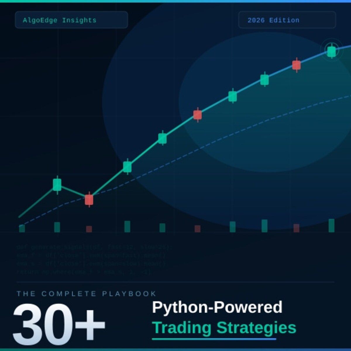
② One strategy in this book returned 2.3× the S&P 500 on a risk-adjusted basis over 5 years.
Fully coded in Python. Yours to run today.
The 2026 Playbook — 30+ backtested strategies,
full code included, ready to deploy.
20% off until Tuesday. Use APRIL2026 at checkout.
$79 → $63.20 · Expires April 14.
→ Grab it before Tuesday
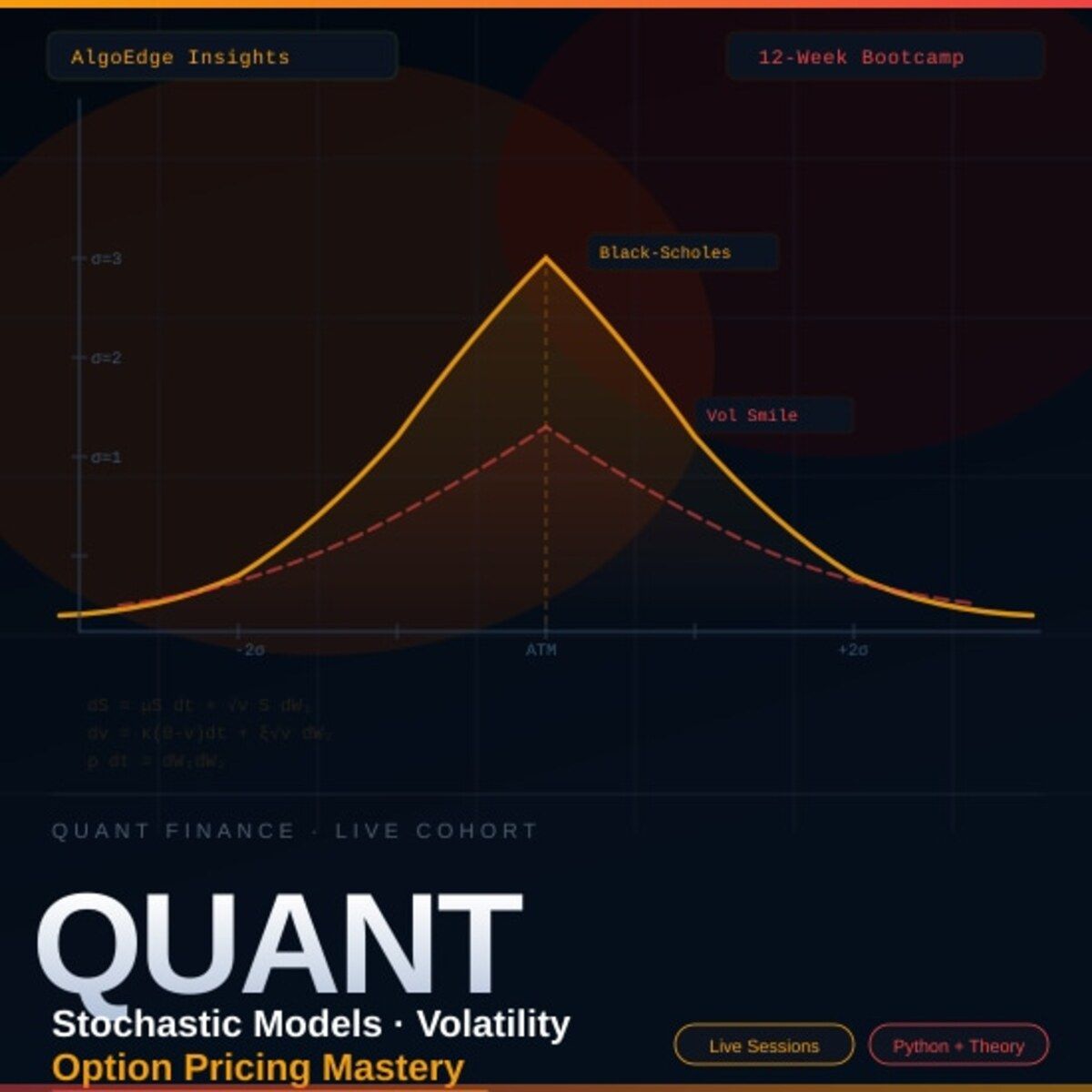
⑤ Most quant courses teach you to watch. This one makes you build.
Live. Weekly. With feedback on your actual code.
The AlgoEdge Quant Finance Bootcamp — 12 weeks of stochastic models, Black-Scholes, Heston, volatility surfaces, and exotic options. Built from scratch in Python.
Not pre-recorded. Not self-paced. Live sessions, weekly homework, direct feedback, and a full code library that's yours to keep.
Cohort size is limited intentionally — so every question gets answered.
→ Before you enroll, reach out for a 15-minute fit check. No pitch, no pressure.
📩 Email first: [email protected]
Premium Members – Your Full Notebook Is Ready
The complete Google Colab notebook from today’s article (with live data, full Hidden Markov Model, interactive charts, statistics, and one-click CSV export) is waiting for you.
Preview of what you’ll get:

Inside the Strategy Lab
Install & Imports — upgrades Plotly and loads all dependencies (NumPy, Pandas, SciPy FFT, Matplotlib, Seaborn, Plotly)
PLTR Data Fetching — pulls 5 years of daily OHLCV data from the EODHD API with configurable symbol and date range
Mellin Transform Theory — markdown explanation of the 3-step causal Mellin algorithm with a parameter reference table for
σMellin Spectrum of Close Prices — log-time resampling + one-sided FFT applied to raw close prices, plotted as a magnitude vs. scale chart
Mellin Spectrum of Log Returns — same transform applied to absolute log returns, with interpretation notes on what each frequency peak represents
Low-Pass Filtering on Returns — the
mellin_lowpass_causalfunction with a 2×2 subplot grid comparing all four parameter combos (window sizes 64–512, cutoffs 0.05–0.30)Low-Pass Filtering on Raw Prices — the
mellin_lowpass_raw_pricefunction with another 2×2 comparison grid across different smoothing strengthsSliding Causal Spectrogram — the
sliding_causal_mellinfunction producing a time × scale heatmap rendered interactively with PlotlyFinal Combined Visualization — overlays the spectrogram heatmap (background) with raw price and Mellin-filtered price (dual y-axis) across the full 2021–2026 date range
Conclusions — Mellin vs. Moving Average comparison table, use cases, limitations, and full references list
Free readers – you already got the full breakdown and visuals in the article. Paid members – you get the actual tool.
Not upgraded yet? Fix that in 10 seconds here👇