
Sponsored by

How Jennifer Aniston’s LolaVie brand grew sales 40% with CTV ads

The DTC beauty category is crowded. To break through, Jennifer Aniston’s brand LolaVie, worked with Roku Ads Manager to easily set up, test, and optimize CTV ad creatives. The campaign helped drive a big lift in sales and customer growth, helping LolaVie break through in the crowded beauty category.
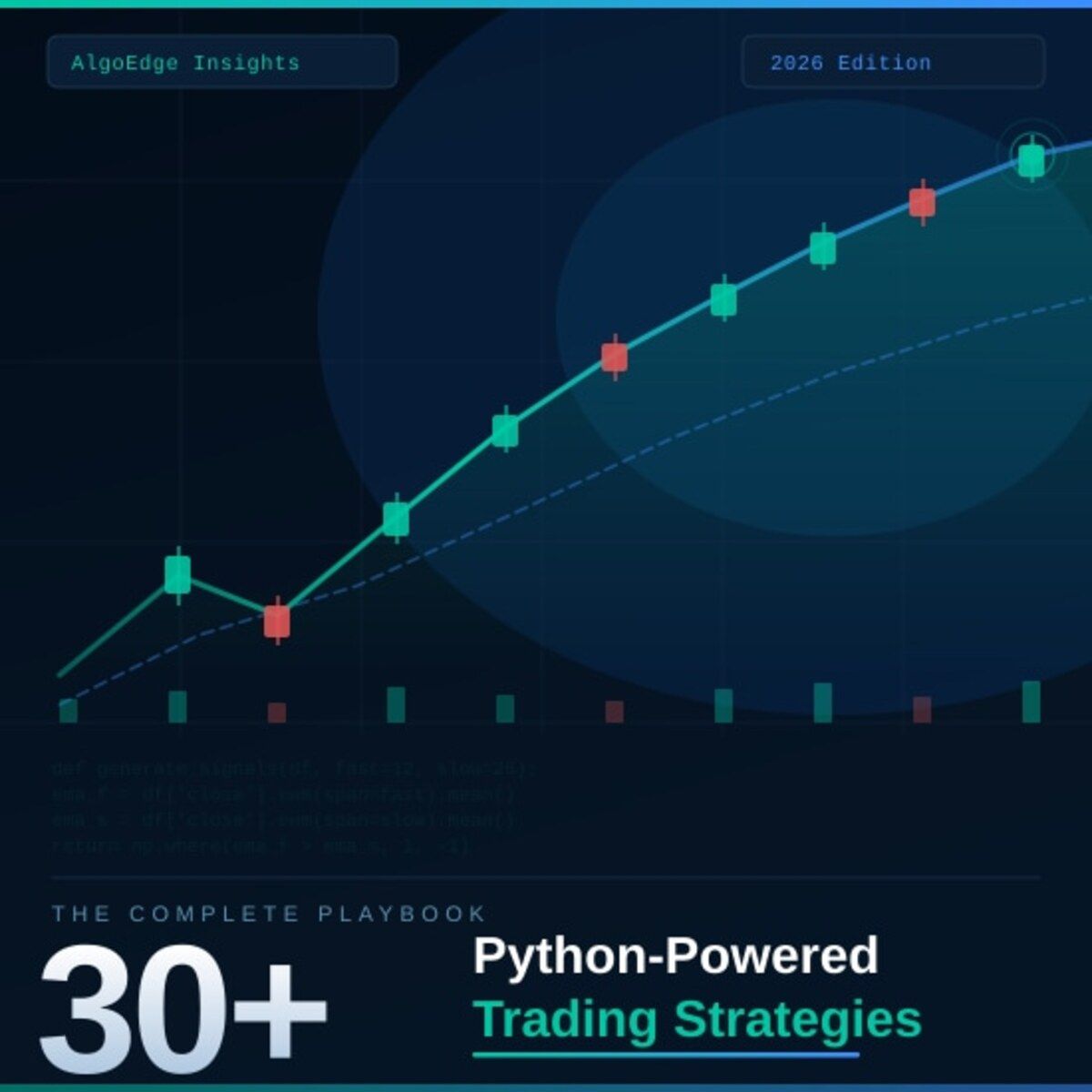
② One strategy in this book returned 2.3× the S&P 500 on a risk-adjusted basis over 5 years.
Fully coded in Python. Yours to run today.
The 2026 Playbook — 30+ backtested strategies,
full code included, ready to deploy.
20% off until Tuesday. Use APRIL2026 at checkout.
$79 → $63.20 · Expires April 28.
→ Grab it before Tuesday
⑤ Most quant courses teach you to watch. This one makes you build.
Live. Weekly. With feedback on your actual code.
The AlgoEdge Quant Finance Bootcamp — 12 weeks of stochastic models, Black-Scholes, Heston, volatility surfaces, and exotic options. Built from scratch in Python.
Not pre-recorded. Not self-paced. Live sessions, weekly homework, direct feedback, and a full code library that's yours to keep.
Cohort size is limited intentionally — so every question gets answered.
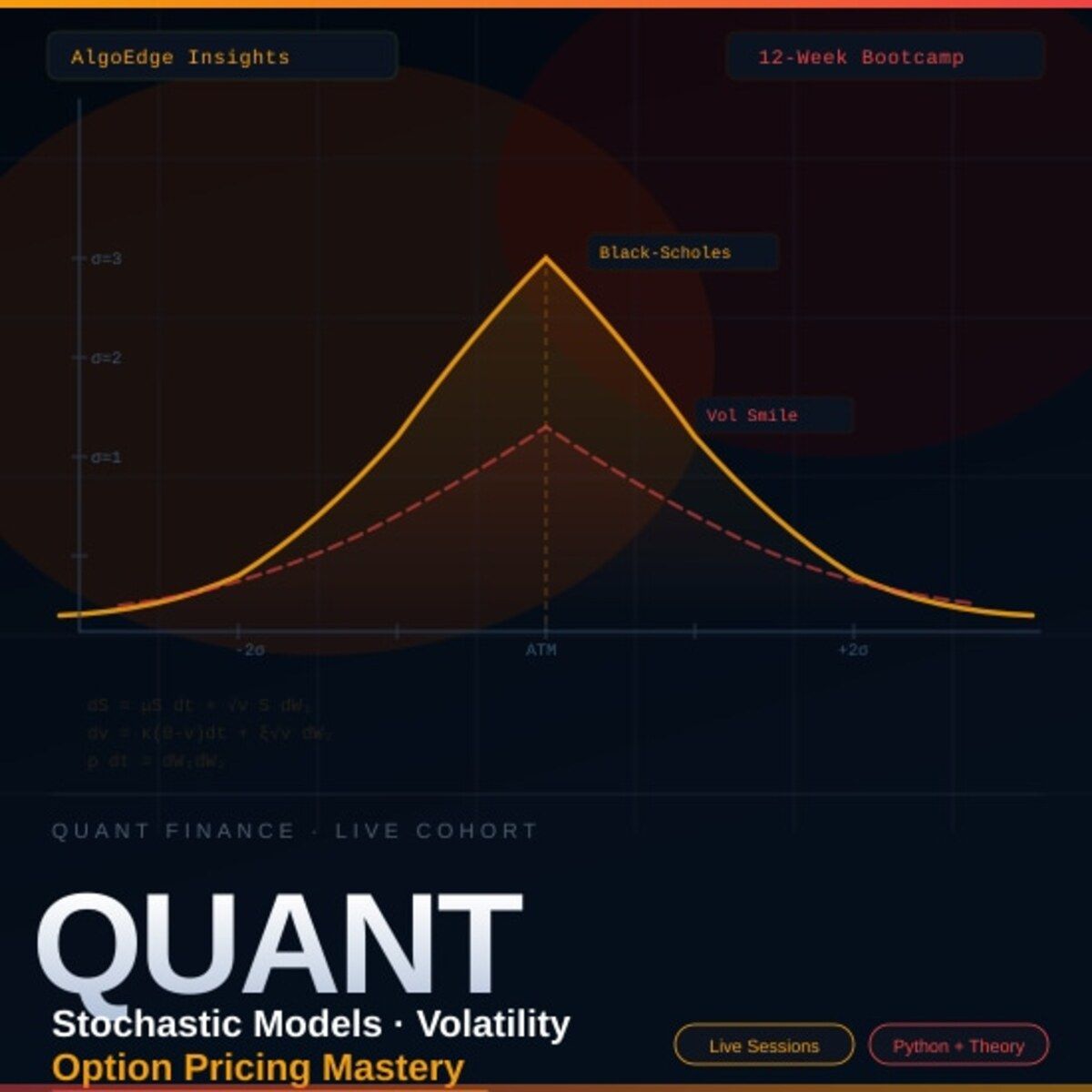
→ Before you enroll, reach out for a 15-minute fit check. No pitch, no pressure.
📩 Email first: [email protected]
Premium Members – Your Full Notebook Is Ready
The complete Google Colab notebook from today’s article (with live data, full Hidden Markov Model, interactive charts, statistics, and one-click CSV export) is waiting for you.
Preview of what you’ll get:

Inside the Strategy Lab
Install and imports — installs all 6 libraries (yfinance, xlsxwriter, pygal, pycirclize, radarchart-py, plotly) plus core imports for numpy, pandas, matplotlib, and plotly
Basic stock comparison (Matplotlib) — fetches live P/E, ROE, Debt/Equity, Profit Margin, and Revenue Growth for MSFT, AAPL, META, and NVDA via yfinance and plots one raw polygon per stock on a polar axis
Optimized stock comparison (Matplotlib) — fetches EPS, Beta, Current Ratio, Revenue/Share, and Earnings Growth for ORCL, AMZN, GOOG, and TSLA, applies min-max normalization (0–1 scale), and plots the normalized comparison for fairer cross-stock analysis
Portfolio analysis via XlsxWriter — writes an Equal-Weighted vs Mean-Variance portfolio comparison across Return, Volatility, Sharpe, CVaR, and Omega Ratio directly into an Excel
.xlsxfile with a filled radar chart, plus a Matplotlib inline previewPerformance measures via Pygal — renders an SVG radar chart comparing EW, RP, and 60/40 portfolios across 5 metrics (1999–2021 including COVID), plus a Matplotlib backup for guaranteed inline display
Multivariate visualization with radar_chart — defines a full custom
radar_chart_fnhelper with configurable markers, grid, fill, and legend, then plots VAMA vs VAMA1 vs VAMA2 backtesting results across 8 performance axes, plus a simpler agricultural portfolio weights exampleFinancial radar charts with pyCirclize — two charts: NVDA vs AMD on 5 profitability ratios (2023), and a 4-year MSFT income statement (2022–2025) with per-year line styling (dotted for 2025, solid for prior years) and square markers
DuPont analysis with Plotly — interactive
line_polarradar comparing AAPL vs MSFT on the 6-component Extended DuPont framework (Interest Burden, Tax Burden, Operating Margin, Asset Turnover, Equity Multiplier, ROE) for FY 2024Options Greeks comparison — Plotly
Scatterpolarchart comparing Long Call, Long Put, and Iron Condor across Delta, Gamma, Vega, Theta, Rho, and Implied Volatility, with hover tooltips showing strategy name and exact valuesMacroeconomic benchmarking + MA SWOT analysis — radarchart-py comparison of USA/China/India on 4 macro indicators (Oct 2025) with a Matplotlib fallback, followed by a full 10-MA SWOT radar scored 1–5 across Lag Reduction, Smoothness, Adaptivity, Noise Robustness, and Complexity, plus a summary scores table sorted by total
Free readers – you already got the full breakdown and visuals in the article. Paid members – you get the actual tool.
Not upgraded yet? Fix that in 10 seconds here👇