Does your car insurance cover what really matters?

Not all car insurance is created equal. Minimum liability coverage may keep you legal on the road, but it often won’t be enough to cover the full cost of an accident. Without proper limits, you could be left paying thousands out of pocket. The right policy ensures you and your finances are protected. Check out Money’s car insurance tool to get the coverage you actually need.
Elite Quant Plan – 14-Day Free Trial (This Week Only)
No card needed. Cancel anytime. Zero risk.
You get immediate access to:
Full code from every article (including today’s HMM notebook)
Private GitHub repos & templates
All premium deep dives (3–5 per month)
2 × 1-on-1 calls with me
One custom bot built/fixed for you
Try the entire Elite experience for 14 days — completely free.
→ Start your free trial now 👇
(Doors close in 7 days or when the post goes out of the spotlight — whichever comes first.)
See you on the inside.
👉 Upgrade Now →
🔔 Limited-Time Holiday Deal: 20% Off Our Complete 2026 Playbook! 🔔
Level up before the year ends!
AlgoEdge Insights: 30+ Python-Powered Trading Strategies – The Complete 2026 Playbook
30+ battle-tested algorithmic trading strategies from the AlgoEdge Insights newsletter – fully coded in Python, backtested, and ready to deploy. Your full arsenal for dominating 2026 markets.
Special Promo: Use code WINTER2025 for 20% off
Valid only until December 31, 2025 — act fast!
👇 Buy Now & Save 👇
Instant access to every strategy we've shared, plus exclusive extras.
— AlgoEdge Insights Team
Premium Members – Your Full Notebook Is Ready
The complete Google Colab notebook from today’s article (with live data, full Hidden Markov Model, interactive charts, statistics, and one-click CSV export) is waiting for you.
Preview of what you’ll get:

Inside:
Automatic gold data download (2008 → today)
Real 3-state Gaussian HMM for volatility regimes
Beautiful interactive Plotly charts
Regime duration & performance tables
Ready-to-use CSV export
Bonus: works on Bitcoin, SPX, or any ticker with one line change
Free readers – you already got the full breakdown and visuals in the article. Paid members – you get the actual tool.
Not upgraded yet? Fix that in 10 seconds here👇
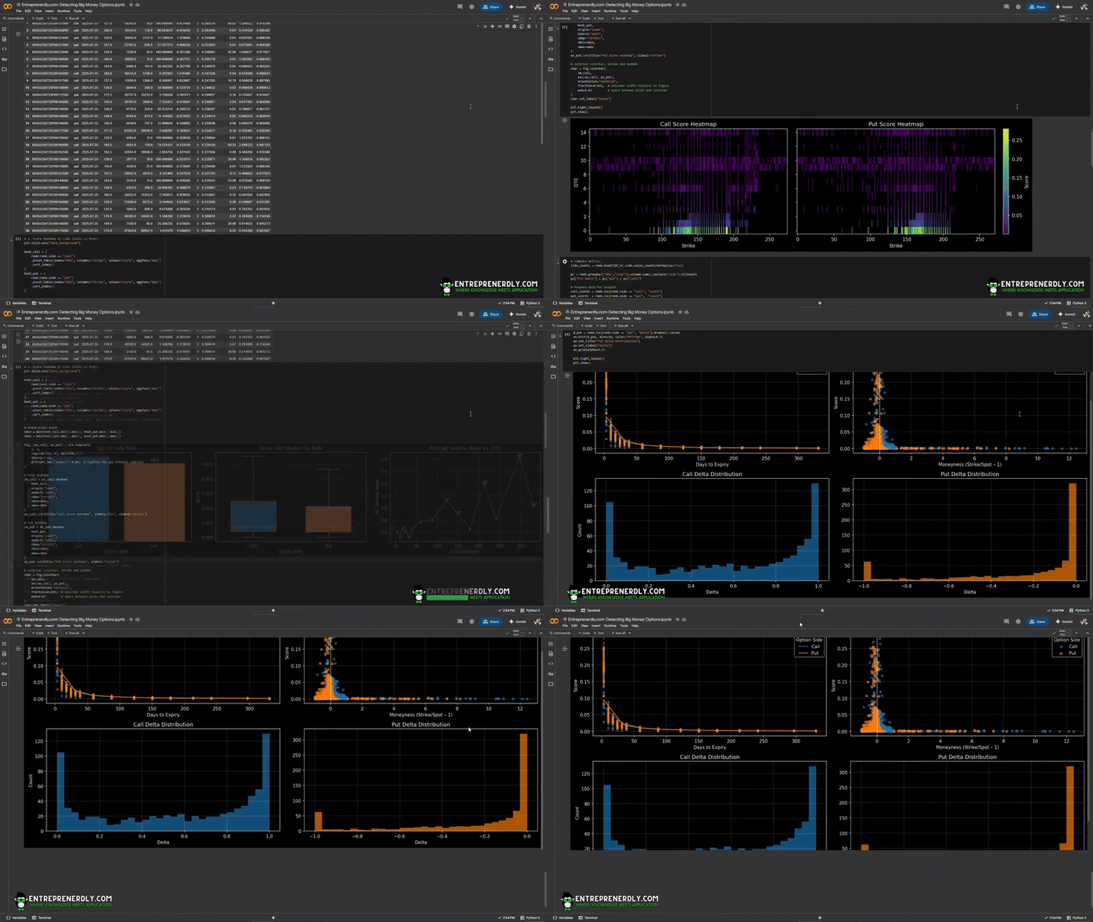
Google Collab Notebook With Full Code Is Available In the End Of The Article Behind The Paywall 👇 (For Paid Subs Only)
Most options data is noise. However, there are a few contracts that can tell a story worth knowing.
If we zero in on where open interest and volume surge together, we can spot which strikes attract serious capital.
We produce a composite score aiming to identify such capital by ranking contracts by size, stickiness, and distance from the current price.
The approach gives us a live heatmap of where big money is actually betting and which contracts pull in the largest flows.
The complete Python notebook for the analysis is provided below.
But what can you actually DO about the proclaimed ‘AI bubble’? Billionaires know an alternative…
Sure, if you held your stocks since the dotcom bubble, you would’ve been up—eventually. But three years after the dot-com bust the S&P 500 was still far down from its peak. So, how else can you invest when almost every market is tied to stocks?
Lo and behold, billionaires have an alternative way to diversify: allocate to a physical asset class that outpaced the S&P by 15% from 1995 to 2025, with almost no correlation to equities. It’s part of a massive global market, long leveraged by the ultra-wealthy (Bezos, Gates, Rockefellers etc).
Contemporary and post-war art.
Masterworks lets you invest in multimillion-dollar artworks featuring legends like Banksy, Basquiat, and Picasso—without needing millions. Over 70,000 members have together invested more than $1.2 billion across over 500 artworks. So far, 25 sales have delivered net annualized returns like 14.6%, 17.6%, and 17.8%.*
Want access?
Investing involves risk. Past performance not indicative of future returns. Reg A disclosures at masterworks.com/cd
1. Finding Where the Big Money Plays
Large, unusual trades set the tone for price action. Institutions show intent not in single trades, but in where size persists and grows over time.
Traditional scanners show volume spikes or unusual activity, but miss the subtle footprints left by accumulation, sticky open interest, or far-out bets.
To cut through the noise, we derive a composite score. This method ranks every contract using three inputs:
Open Interest: measures size. Contracts with more open positions signal where the crowd commits.
OI/Volume Ratio: measures stickiness. High ratios flag contracts where traders open positions and hold, not just churn for liquidity.
Strike Distance (OTM): measures risk appetite. Big money concentrates near-the-money but sometimes places significant OTM bets.
The Scoring Formula
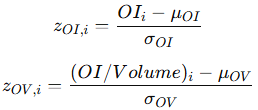
We normalize open interest and OI/volume within each expiry using a z-score:

Here:
OIi is the open interest for contract i
(OI/Volume)i is the open interest-to-volume ratio for contract i
μ and σ are the mean and standard deviation for each expiry date.
We then rank these z-scores on a percentile basis within each expiry.
This keeps contracts with abnormal size or stickiness at the top, regardless of overall market mood.
Strike distance is scaled as:

K_OTM is a scaling factor.
Shorter-dated options are penalized using:

DTEi is days to expiry.
The final composite score for each contract:

Weights are tuned for practical signal:
wOI=0.4
wOV=0.4
wOTM=0.2
Practical Example
Suppose there is a call option with:
High open interest relative to peers
OI/volume ratio in the top decile
Strike close to spot
30 days to expiry
This contract scores near the top. It reflects big money building a position.
By contrast, a weekly put with low OI and high churn scores low, even if it trades heavy volume.
2. Identifying Big Money Options in Python
2.1 Get the Data and Compute Score
We use yfinance to pull the full option chain, apply liquidity filters, and rank contracts by the composite score.
To make the code adjustable, we state the parameters at the beginning of the workflow.
Step 1: Set Parameters and Pull Data
Each parameter is explained in the code comments below, from liquidity filters to scoring weights.
import pandas as pd
import numpy as np
import yfinance as yf
from datetime import date
from math import erf, log, sqrt
import matplotlib.pyplot as plt
import warnings
warnings.filterwarnings("ignore")

# PARAMETERS
TICKER     = "NVDA"   # Ticker symbol; set to any liquid underlying
TOP_N      = 50       # Number of top contracts to return; higher values include more noise
K_OTM      = 2.0      # Out-of-the-money scaling; higher = more penalty for far strikes
MAX_DTE    = 360      # Maximum days to expiry; lower to focus on short-term flows
MIN_VOLUME = 10       # Minimum daily volume; raises threshold for “active” contracts
MIN_OI     = 100      # Minimum open interest; filters out illiquid/ignored contracts
CAP_OI_VOL = 100      # Cap for OI/Volume ratio; prevents outliers from distorting scores
W_OI_Z     = 0.4      # Weight on open interest z-score; higher = more focus on total size
W_OV_Z     = 0.4      # Weight on OI/volume z-score; higher = more focus on stickiness
W_OTM      = 0.2      # Weight on OTM (strike distance); higher = more penalty for contracts far from spot
We use NVDA as an example and loop through every listed expiry, for both calls and puts.
We keep only fields needed for scoring: strike, open interest, volume, last price, and IV.
# fetch full chain with IV
tkr   = yf.Ticker(TICKER)
spot  = tkr.history(period="1d")["Close"].iloc[-1]
today = pd.to_datetime(date.today())

rows = []
for exp in tkr.options:
    oc = tkr.option_chain(exp)
    for side, df in (("call", oc.calls), ("put", oc.puts)):
        part = df[[
            "contractSymbol",
            "strike",
            "openInterest",
            "volume",
            "lastPrice",
            "impliedVolatility"
        ]].copy()
        part["side"]  = side
        part["exp"]   = pd.to_datetime(exp)
        part["snap"]  = today
        part["spot"]  = spot
        rows.append(part)
raw = pd.concat(rows, ignore_index=True)
Step 2: Apply Filters and Compute Score Inputs
We then remove contracts with short expiry, low OI, or low volume.
Each contract gets features for days-to-expiry, OTM weighting, and the OI/Volume ratio.
We then normalize OI and OI/Volume for each expiry using z-scores, then percentile rank within expiry.
The composite score is finally computed.
# score computation
rank = raw.copy()
rank["dte"]   = (rank.exp - rank.snap).dt.days.clip(lower=1)
rank = rank[
    (rank.dte <= MAX_DTE) &
    (rank.volume >= MIN_VOLUME) &
    (rank.openInterest >= MIN_OI)
]
rank["dte_w"] = 1 / rank.dte
rank["otm_w"] = (1 - np.abs(rank.strike/ rank.spot - 1)*K_OTM).clip(lower=0)
rank["oi_vol"] = (rank.openInterest / rank.volume).clip(upper=CAP_OI_VOL)
rank["oi_z"] = rank.groupby("exp").openInterest.transform(
    lambda x: (x - x.mean())/x.std(ddof=0)
).fillna(0)
rank["ov_z"] = rank.groupby("exp").oi_vol.transform(
    lambda x: (x - x.mean())/x.std(ddof=0)
).fillna(0)
rank["oi_rank"] = rank.groupby("exp").oi_z .transform(lambda x: x.rank(pct=True))
rank["ov_rank"] = rank.groupby("exp").ov_z .transform(lambda x: x.rank(pct=True))
core = W_OI_Z*rank.oi_rank + W_OV_Z*rank.ov_rank + W_OTM*rank.otm_w
rank["score"] = core * rank.dte_w
rank = rank.sort_values("score", ascending=False).reset_index(drop=True)
We rename columns for clarity:
# rename lastPrice → last_price, impliedVolatility → iv
rank.rename(columns={
    "lastPrice": "last_price",
    "impliedVolatility": "iv"
}, inplace=True)
Step 3: Compute Delta (Optional)
For each contract, we calculate the Black-Scholes-Merton delta. This adds context for risk and directional exposure.
# BSM delta
def normal_cdf(x):
    return 0.5 * (1 + erf(x / sqrt(2)))

def bsm_delta(row, r=0.0):
    T = row.dte / 365
    sigma = row.iv
    if T <= 0 or sigma <= 0:
        return np.nan
    d1 = (log(row.spot/row.strike) + (r + 0.5 * sigma**2) * T) / (sigma * sqrt(T))
    nd1 = normal_cdf(d1)
    return nd1 if row.side == "call" else nd1 - 1

rank["delta"] = rank.apply(bsm_delta, axis=1)
Step 4: View Top Contracts by Score
Now we can display the contracts most likely to matter.
The output includes contract, side, expiry, strike, OI, volume, OI/Vol, z-scores, days to expiry, score, price, IV, and delta.
# display top-N with new columns
cols = [
    "contractSymbol", "side", "exp", "strike",
    "openInterest", "volume", "oi_vol", "oi_z",
    "dte", "score", "last_price", "iv", "delta"
]
display(rank.head(TOP_N)[cols])
Figure 1. Top-Scoring NVDA Options Contracts Ranked by Big Money Activity Signal.
At the surface we see that top-scoring contracts are almost all short-dated and near the money.
Big money is concentrated in the next expiry, with little activity in longer-term or far-OTM strikes.
This points to big money focusing on immediate, directional risk.
2.1 Score heatmap by Option Side
We produce a matplotlib to show where flows cluster across strikes and expiries.
Each cell shows the highest score at a given strike and DTE, split by calls and puts.
# 1. Score heatmap by side (Calls vs Puts)
plt.style.use("dark_background")

heat_call = (
    rank[rank.side == "call"]
    .pivot_table(index="dte", columns="strike", values="score", aggfunc="max")
    .sort_index()
)
heat_put = (
    rank[rank.side == "put"]
    .pivot_table(index="dte", columns="strike", values="score", aggfunc="max")
    .sort_index()
)

# share color scale
vmin = min(heat_call.min().min(), heat_put.min().min())
vmax = max(heat_call.max().max(), heat_put.max().max())

fig, (ax_call, ax_put) = plt.subplots(
    1, 2,
    figsize=(16, 4), dpi=150,
    sharey=True,
    gridspec_kw={"wspace": 0.05}  # tighten the gap between subplots
)

# Call heatmap
im_call = ax_call.imshow(
    heat_call,
    origin="lower",
    aspect="auto",
    cmap="viridis",
    vmin=vmin,
    vmax=vmax
)
ax_call.set(title="Call Score Heatmap", ylabel="DTE", xlabel="Strike")

# Put heatmap
im_put = ax_put.imshow(
    heat_put,
    origin="lower",
    aspect="auto",
    cmap="viridis",
    vmin=vmin,
    vmax=vmax
)
ax_put.set(title="Put Score Heatmap", xlabel="Strike")

# external colorbar, shrunk and padded
cbar = fig.colorbar(
    im_call,
    ax=[ax_call, ax_put],
    orientation="vertical",
    fraction=0.025,  # colorbar width relative to figure
    pad=0.02         # space between plots and colorbar
)
cbar.set_label("Score")

plt.tight_layout()
plt.show()
Figure 2. Score Heatmaps for NVDA Call and Put Options by Strike and Days to Expiry
High scores cluster at short expiries and near-the-money strikes for both calls and puts.
There is little flow in longer-dated or far-OTM options. Most of the activity is concentrated where risk and liquidity are highest short-term.
2.2 Bullish vs Bearish Sentiment
We break down the top-ranked contracts to gauge where the largest flows lean, i.e. calls vs puts, and how this bias shifts across expiries.
The first chart shows the proportion of calls and puts in the top-scoring contracts.
A heavy call or put skew can signal bullishness or hedging.
The second chart plots the score distribution for each side. This exposes whether high-scoring contracts are balanced or dominated by one side.
The third chart tracks the put/call volume ratio by days to expiry. Spikes in this ratio flag bursts of defensive activity.
# Compute metrics
side_counts = rank.head(TOP_N).side.value_counts(normalize=True)

pc = rank.groupby(["dte","side"]).volume.sum().unstack("side").fillna(0)
pc["P/C Ratio"] = pc["put"] / pc["call"]

# Prepare data for boxplot
call_scores = rank.loc[rank.side == "call", "score"]
put_scores  = rank.loc[rank.side == "put",  "score"]

# Create 1×3 grid
fig, (ax1, ax2, ax3) = plt.subplots(
    1, 3,
    figsize=(18, 4),
    dpi=150
)

# 1) Top-N Side Bias
ax1.bar(
    side_counts.index,
    side_counts.values,
    color=["#1f77b4", "#ff7f0e"]
)
ax1.set_title(f"Top {TOP_N} Side Bias")
ax1.set_xlabel("Option Side")
ax1.set_ylabel("Proportion")
for i, v in enumerate(side_counts.values):
    ax1.text(i, v + 0.01, f"{v:.0%}", ha="center")
ax1.grid(alpha=0.2)

# 2) Score Distribution by Side (pure Matplotlib boxplot)
bplot = ax2.boxplot(
    [call_scores, put_scores],
    positions=[0,1],
    widths=0.6,
    patch_artist=True,
    showfliers=False
)
# color the boxes
colors = ["#1f77b4", "#ff7f0e"]
for patch, color in zip(bplot['boxes'], colors):
    patch.set_facecolor(color)
ax2.set_xticks([0,1])
ax2.set_xticklabels(["Call", "Put"])
ax2.set_title("Score Distribution by Side")
ax2.set_xlabel("Option Side")
ax2.set_ylabel("Score")
ax2.grid(alpha=0.2)

# 3) Put/Call Volume Ratio vs. DTE
ax3.plot(
    pc.index,
    pc["P/C Ratio"],
    marker="o",
    linestyle="-",
    color="#9467bd",
    lw=1.5
)
ax3.set_title("Put/Call Volume Ratio vs. DTE")
ax3.set_xlabel("Days to Expiry")
ax3.set_ylabel("P/C Volume Ratio")
ax3.grid(alpha=0.3)
# Annotate top ratios
for dte, ratio in pc["P/C Ratio"].nlargest(5).items():
    ax3.text(dte, ratio, f"{ratio:.2f}", ha="center", va="bottom", fontsize=8)

plt.tight_layout()
plt.show()
Figure 3. Put/Call Bias, Score Distribution, and Volume Ratio for Top-Scoring NVDA Options
The flow is nearly balanced, with a slight tilt toward puts (52%).
The put/call volume ratio trends higher at longer expiries. This indicates more defensive or hedge-driven activity in far-dated contracts.
Near-term options remain the main battleground for both calls and puts.
2.2 Moneyness, Delta and DTE
Now we can break down how score, risk, and distance from spot interact.
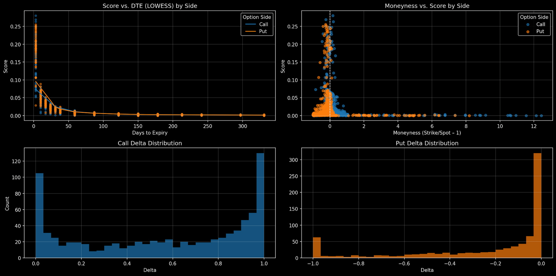
The first chart plots score against days to expiry. The second chart compares score to moneyness (strike relative to spot).
The third and fourth charts show the delta distributions for calls and puts.
from statsmodels.nonparametric.smoothers_lowess import lowess

# ensure moneyness exists
rank["moneyness"] = rank.strike / rank.spot - 1

# prepare figure
fig, axes = plt.subplots(
    2, 2,
    figsize=(16, 8),
    dpi=150
)

# Top‐left: Score vs DTE with LOWESS by side
ax = axes[0, 0]
for side, color in [("call", "#1f77b4"), ("put", "#ff7f0e")]:
    df_side = rank[rank.side == side]
    x = df_side.dte.values
    y = df_side.score.values
    ax.scatter(x, y, s=15, alpha=0.5, color=color)
    # LOWESS smoothing
    sm = lowess(y, x, frac=0.3)
    ax.plot(sm[:, 0], sm[:, 1], color=color, label=side.capitalize())
ax.set_title("Score vs. DTE (LOWESS) by Side")
ax.set_xlabel("Days to Expiry")
ax.set_ylabel("Score")
ax.legend(title="Option Side")
ax.grid(alpha=0.2)

# Top‐right: Moneyness vs. Score by side
ax = axes[0, 1]
for side, color in [("call", "#1f77b4"), ("put", "#ff7f0e")]:
    df_side = rank[rank.side == side]
    ax.scatter(
        df_side.moneyness,
        df_side.score,
        s=25,
        alpha=0.6,
        color=color,
        label=side.capitalize()
    )
ax.set_title("Moneyness vs. Score by Side")
ax.set_xlabel("Moneyness (Strike/Spot – 1)")
ax.set_ylabel("Score")
ax.axvline(0, color="white", linestyle="--", linewidth=1)
ax.legend(title="Option Side")
ax.grid(alpha=0.2)

# Bottom‐left: Call Delta Distribution
ax = axes[1, 0]
d_call = rank.loc[rank.side == "call", "delta"].dropna().values
ax.hist(d_call, bins=30, color="#1f77b4", alpha=0.7)
ax.set_title("Call Delta Distribution")
ax.set_xlabel("Delta")
ax.set_ylabel("Count")
ax.grid(alpha=0.2)

# Bottom‐right: Put Delta Distribution
ax = axes[1, 1]
d_put = rank.loc[rank.side == "put", "delta"].dropna().values
ax.hist(d_put, bins=30, color="#ff7f0e", alpha=0.7)
ax.set_title("Put Delta Distribution")
ax.set_xlabel("Delta")
ax.grid(alpha=0.2)

plt.tight_layout()
plt.show()
Figure 4. Score vs. DTE, Moneyness, and Delta Distributions for Top NVDA Options
High-scoring contracts cluster at short expiries and near-the-money strikes.
Most activity is in options with deltas near 0 or 1. This reflects focus on immediate, high-liquidity trades and deep risk exposures.
3. How to Use This in Your Own Trading
Start each trading day by scanning the top-scoring contracts.
Note where size is clustering. These strikes and expiries are where the market’s attention is highest.
If you trade directionally, watch for heavy call activity at strikes just above spot. This can front-run breakouts or continuation moves.
If puts dominate at the money, it signals funds hedging downside or bracing for volatility.
If your setup aligns with where big money concentrates, conviction increases.
For options spreads, use the top-ranked contracts as your legs. Avoid thin, low-score strikes, which can trap you in illiquid trades.
4. Limitations and Extensions
Limitations:
It misses hidden orders, dark pool trades, and off-exchange activity.
Complex multi-leg spreads may not show up as outsized OI or volume in a single contract.
Earnings runs and event-driven trades can skew scores, especially near catalysts.
Illiquid tickers or very long-dated options often lack reliable data.
There is not a time-series component to the analysis.
Extensions:
Run scans intraday, not just end-of-day, to catch real-time flows.
Track how the top scores shift over time for trend confirmation or regime changes.
Compare score heatmaps across tickers to spot sector or index-wide positioning.
Incorporate additional signals, like implied volatility skew or unusual trade size, for a deeper read.
Get option prices and their statistics over-time to confirm over-time trends.
Concluding Thoughts
Markets can show their priorities through where size gathers and where it doesn’t.
The same methods used to spot opportunity can also help you avoid false signals.
Sometimes, knowing where not to trade is the sharpest edge you have.
Subscribe to our premium content to read the rest.
Become a paying subscriber to get access to this post and other subscriber-only content.
Upgrade


